
Branding With Kraft-Heinz
Written By Jordyn Salahiddine-Rose
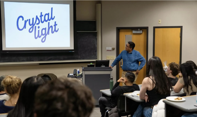
On Thursday, April 3rd, The Vault hosted an insightful presentation from Timothy Leonard, brand manager at Kraft Heinz, where he shared how he worked his way up the design business to get to where he is now. He also emphasized the different inner workings of design and its importance with a fun Q&A at the end.

Leonard was born and raised in Hawaii, but because his father was in the military, his family had to move from Hawaii to Wisconsin. And UW-Madison is also where he ended up going to college. After graduating from UW-Madison with a political science degree, he had a lot of uncertainty about his future career path. He ended up selling suits at Macy's in Madison, cultivating his appreciation for retail.After successfully moving up the ladder at Macy's, Leonard began running the beauty department. This was the beginning of his work for Estée Lauder, where he stated that he first learned to sell a strategy.
Leonard focused the beginning of his presentation on discussing the lessons he’s learned from being in the design business and the lessons he tries to live by. Those concepts include morality, passion, ownership, observation and stewardship. He emphasized how important it is for him and others to live by these. Leonard said he learned these lessons through various books he’s read, including books by UW-Madison professors. He also included various quotes that he’s found inspiration from, one of them being “design is thinking made visual” from Saul Bass, a graphic designer and Oscar-winning filmmaker. This prompted him to say “design with insight,” which Leonard referred to throughout his presentation. This saying, he explained, means that one should create such a distinctive product that consumers should be different or that they should sort themselves. Ultimately, he emphasized how one should always be designing with a purpose so that your designs can be the most successful.

Leonard then went into detail on the projects he had recently worked on, including Crystal Light and Capri Sun. He started with talking about the Crystal Light project and the process he took to change the logo. He mentioned how he understood what the brand meant to various people, especially the Millennial and Gen X generations, so they knew that the change could be essential to the success of the company. They choose to keep the cursive font to connect with consumers because older generations know cursive and they would tell their kids about how they learned it in school. They then modernized the cursive, made it bolder and took away the pink dot because they didn’t see a need for it anymore. Through this explanation, Leonard emphasized their choice to market to the older generations rather than the new generations because they did it once very well and it can be difficult for a product to market to different audiences.
The next project Leonard talked about was the change in the Capri Sun logo and how they will now be sold in bottles in convenience stores. He expressed that the company wanted to get their products on shelves in convenience stores, but that wasn’t possible for the iconic kids' drink, since they used to only be sold in pouches. So, they decided to start selling Capri Sun in bottles, but they had to create a design for the bottle that would reach their target market. They first struggled with the front design on the bottle because they still wanted it to look like their well-known brand. Ultimately, they decided on the one that had the name the biggest down the front with a big blue background behind the name. Leonard highlighted a key lesson from the project, which is that when a brand gets into a new channel, the Capri Sun entering the bottle market, one must think of ways to innovate the product so that it stands out more compared to their competitors. It was so interesting to hear the process and reasoning behind these complex projects, especially from someone as qualified and experienced as Leonard.


Leonard then turned the floor to the audience for a Q&A where people asked a variety of questions on the business of design, but the most interesting part of the whole questioning part was when the audience started giving suggestions on the kinds of products Crystal Light and Capri Sun could make. Leonard showed his enthusiasm for a couple of the products the audience suggested, and it was fun to see how interactive the Q&A became. This part of the presentation built a connection between the audience and Leonard through Vault members showing their excitement and passion for the design process and business.
Throughout the event, Leonard gave an array of advice that I think made an impact on students. He learned this piece of advice when he was just starting out in the design and brand business: “if you can learn to sell something to anyone, you can end up selling anything.” Leonard started out by selling suits, but this helped him to sell different products and their overall brands. With brands, some of them you're able to take more risks, while others you have to stay more safe, especially when the brand is bigger there are more brands coming to you with opportunities. He discussed this piece of advice when talking about some of the ideas he and his group had for many of their products and how many of them didn’t work out as well. The last lesson or advice he gave that stuck with me personally was to“be the category leader,” which inspires us to be leaders when designing and creating new products and to make sure those products have the ability to stand out on shelves.

Overall, this presentation by Timothy Leonard was incredibly insightful and informative by creating a fun environment for students to feel they have the power to design and create themselves. Thank you to Timothy Leonard for such an enlightening presentation and for sparking such interest in this business.